How Hipster, Healthy and Wealthy is the City Where Your Favorite NFL Team Plays?

Favorite NFL teams by the number of Facebook likes via Facebook
The 2014 NFL season is now upon us. If you're any kind of an NFL fan at all, you've heard lots and lots of talk about the 2013 season, what happened and why.
This got me thinking about the types of data we have on these cities / metropolitan areas / states where our favorite NFL teams play and if we can learn anything about team performance or value based on how these communities differ on a variety of measures.
Would metropolitan wealth, size, inequality, well being, or "hipsterness" correlate, or even potentially explain, NFL franchise outcomes of success, specifically market valuation, 2013 performance relative to other teams (measured by DVOA) or playoff appearances since 1999?
What I looked at:
Wealth: I captured metropolitan wealth measured by metropolitan area median household income (Census) and median home price.
Size: Population estimate for 2010 (census), Population estimated for 2013 (census), % difference in that 3 year span.
Inequality: I looked at the Gini Coefficient for each metro area with an NFL team
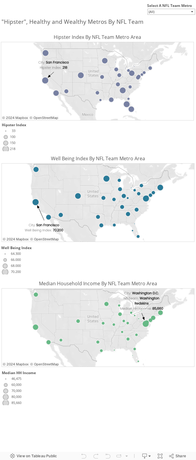
Hipsterness: I looked at the hipster index compiled by 49thingstodo.com . Obviously , this index is not a perfect measure of hipsterness but I did appreciate their main factors - vegan restaurants, fixie bikes, craft breweries, Whole Foods / Trader Joes, Tattoos, Scooters, Sushi, and Vinyl Record stores. My data only goes through round six (so it excludes the sushi and vinyl stores). Obviously there are a lot of issues with an index like this, but it's still somewhat valuable when trying to get a feel for a metropolitan area. If there is a better way to measure hipsterness out there (and I'm sure there is), let me know. Another note - there were four NFL teams that didn't make the hipster list.
Well Being: Well being is from the Gallup tracking of well being (http://www.gallup.com/poll/145913/city-wellbeing-tracking.aspx). The factors that make up their well being index include - % of a metro who are obese, % of a metro who exercises frequently, % of a metro that eats produce frequently, % of a metro that smokes, % of a metro that is uninsured, and % of a metro with daily stress.
So to reiterate - How does the wealth, size, "hipsterness", inequality, and well being of a metropolitan area correlate with or help explain 2013 season performance, franchise valuation, or playoff appearances since 1999?
If you just want to know the top "hipster", healthy and wealthy metros look at these maps below. For a bit more analysis take a look at the observations below the maps.
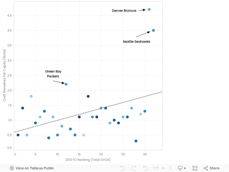
Observation One - 2013 was a great year for teams from states with big craft beer scenes.
Teams that were in states with a higher number of craft breweries per capita fared significantly better in 2013. You can see that a lot of this was due to the success of Seattle and Denver last year who play in states with the highest number of breweries per capita across all the States with NFL teams. We will see if this trend continues in 2014. If Green Bay, Denver and Seattle have especially good seasons this year, we could see a similar relationship in 2014.
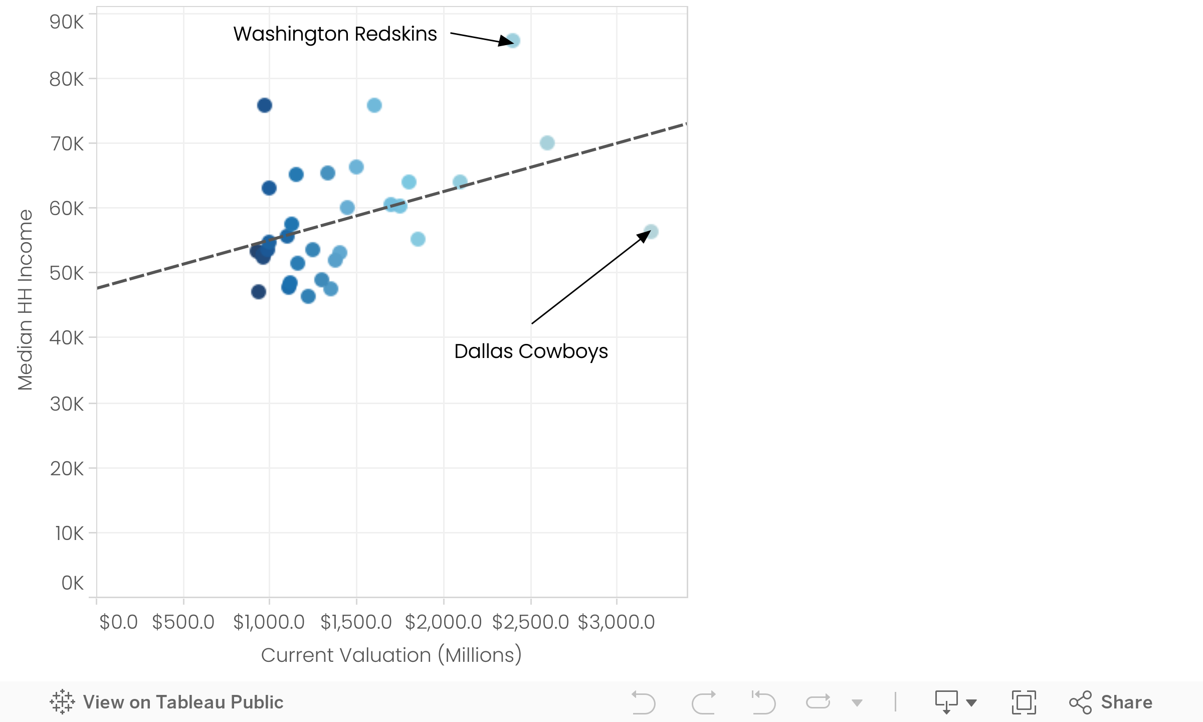
Observation Two - The Cowboys are worth a lot of money and median household income does a pretty good job of explaining the variation in NFL team value.
Data from Forbes (http://www.forbes.com/sites/mikeozanian/2014/08/20/the-nfls-most-valuable-teams/)
The Cowboys are valued by Forbes at 3.2 Billion dollars. This makes them the second most valuable sports team in the world according to Forbes, only Real Madrid is more valuable.
Look at the gap between the most valuable and least valuable team. Why is there such a disparity between the Rams and the Cowboys? Now these rankings are calculated (according to Forbes) by essentially looking at revenue, equity and debt, taking into account the current Stadium situation.
I wanted to understand it a bit more. If the Cowboys make more revenue than the Rams, and have less debt, they should have a higher current valuation.
But is there anything that can explain the difference in current value of NFL teams based on data from their metropolitan area?
Turns out, median household income of the metropolitan area where the team plays, is slightly predictive of how the team is valued. This model shows that median house hold income of the metropolitan area accounts for up to 18% of the variance in the current valuation of nfl teams with 99% confidence (p value < .01). 18% of the difference in current value of NFL teams can be explained by the median income of the city in which they play.
Additionally, if you take the Cowboys out, the percentage of current valuation that is explained by median household income goes up to 32%. Click on the Cowboys and hit exclude, then see how the model shifts.
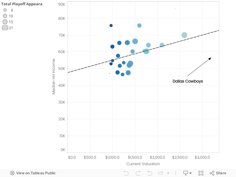
Here's one more additional view of the same data, where the team's are sized based on the number of playoff appearances since 1999. Essentially, with the exception of the Cowboys and Redskins, teams from high income metropolitan areas that make the playoffs are worth the most.
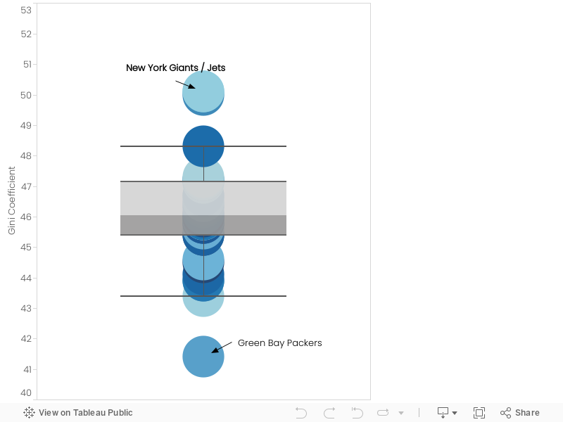
Observation Three - Oakland, San Francisco, Washington D.C. Minnesota and Denver score the highest on Gallup's "Well Being Index." Green Bay has especially high levels of obesity, low inequality, and average levels of exercise.
Here is how the metro areas rank based on Gallup's "Well Being Index." The well being index looks at the % of a metro population that eats vegetables frequently, that smokes, that exercises regularly, that is uninsured, that has daily stress, and that is obese. Not too many surprises here.
33% of the population of Green Bay is Obese. While the metro areas of the Patriots, Raiders, 49ers, Broncos and Chargers and below 1 standard deviation of the mean, Green Bay is the only metro that is above one standard deviation of the mean. In other words - while the Pats, Raiders, 49ers, Broncos and Chargers are playing in metro areas that especially not obese, Green Bay is playing in an area that is exceptionally obese. Cheese and bear man, that'll get ya.
My favorite thing about Green Bay? Not only are they the only metropolitan area that is above one standard deviation in terms of obesity, they also report that they exercise just as frequently as Kansas City or Seattle. I think this highlights either an issue with the nature of the gallup poll (asking people to self report health habits), or beer and cheese are big contributors to obesity. Maybe a bit of both?
One additional note about Green Bay - not only are they the most obese, they also have the lowest levels of inequality among all 32 NFL metro areas. New York has the highest.
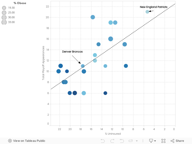
Observation Five - A larger number of playoff appearances in the last 14 years is partly explained by a lower % of uninsured residents (even when you take out New England).
One of the most interesting relationships that emerged was between the percentage of uninsured residents within a metro area and the number of times their teams made the playoffs in the last fourteen years. This relationship is pretty strong with 41% of the variance between playoff appearances explained by the percentage of uninsured residents in a metro area. At first, I just thought this was solely because of the Patriots, who live in a metro area with an uninsured rate of 5.3%, well below the average for all the metros of nfl teams which was 16.2%. However, even when you remove the patriots from the model it only shifts from 41% to 30%, and it is still statistically significant. I'm still trying to come up with a reason why this could be the case, or maybe it's just spurious correlation :). It's interesting nonetheless.
Summary and Wrap Up -
Most "hipster" team by metro - San Francisco 49ers / Oakland Raiders
Team that is the healthiest based on metro - San Francisco 49ers
Team attached to the wealthiest metro - Washington Redskins
Observations and Relationships of Interest -
- It's clear that teams that are valued well make the playoffs a lot and are in metropolitan areas with higher median incomes
- 2013 was a great year for teams in states with big craft beer scenes, driven by Denver and Seattle.
- Green Bay has low levels of inequality, high levels of obesity and an average level of reported exercise.
What questions did this analysis raise? What would you be interested in digging into?
Was there anything in here that surprised you? Questions about methodology or the data sets I used? I'm also willing to share the data. Ask me in the comments!